


Kamadhenu — Appaswamy Real Estates Launch Film
Micro-Films, Brochure & Verbal Identity
Mylapore doesn't need branding. It has ritual, commerce, art, faith, and a street rhythm that's been running for centuries. So when Appaswamy Real Estates came to us with Kamadhenu, a luxury residential development on Luz Road, the brief wasn't really about the building.
It was about the address.
We made an early call: don't market the apartment. Make the neighbourhood the protagonist.
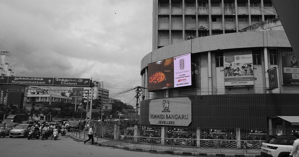
That meant swapping the standard real estate playbook for something closer to a documentary. The main brand film was shot across 25 locations. No constructed sets, no staged inserts. Just Mylapore in motion.


A flower vendor finishing a garland.
Dancers tying their anklets.


Residents in their everyday rhythm.

Rice flour becomes a kolam.
A child leaving the park.

Sound becomes music.


Milk becomes rose milk


Coffee beans being ground and poured.

Each moment captured mid-process, because that sense of becoming
was exactly the feeling we wanted Kamadhenu to carry.

The building appears late in the film only as a miniature. Not as a spectacle. As a continuation.

The building appears late in the film only as a miniature. Not as a spectacle. As a continuation.
Luxury, in this context, wasn't excess. It was walkability.
Cultural continuity. Belonging. The kind of familiarity you can't manufacture with renders.


The Poise of Tradition


For the verbal identity, we landed on a tone we called The Poise of Tradition. Most real estate copy either leans into
aspiration or nostalgia. Kamadhenu needed neither. The language had to feel settled, unhurried, like someone who has lived
in Mylapore long enough to stop explaining it. No superlatives. No urgency. Just quiet confidence in the address itself.
In the heart of Mylapore, where Chennai's cultural pulse beats strongest, Kamadhenu emerges as more than residence—it is reflection.
Every element honors the past while serving today's expectations. The spaces feel familiar yet elevated. Layouts breathe with the neighborhood's ancient cadence.
Kamadhenu adds a thoughtful new chapter, creating belonging without erasure.
The Poise of Tradition
Brand Capsule

We set out to create culture-centric campaigns to bring in new flavours to real estate branding.


Beyond the film, the same logic carried across every touchpoint. A brochure built as a city guide. Photography rooted in texture and lived moments. Twelve vertical micro-films for social.


Every medium held the same position: Mylapore is not a backdrop. It's the asset.
The strongest brand stories don't start with what you're selling. They start with what already exists, and finding where your
brand honestly fits within it.